


We are pleased to introduce 10 new colours of ROSA Gallery professional watercolours in tubes and pans, selected and developed in collaboration with artists.
The expanded ROSA Gallery watercolour palette now includes 100 colours.
• 5 new amazing granulating colours: Ultramarine Grey (798), Twilight Azure (796), Twilight Orange (795), Olive Oxide Grey (790), Deep Red-Pink (789) are perfect for creating true watercolour magic and stunning effects!
• 3 vivid, expressive colours: Ashy Pink (793), Ashy Lilac (794), Dark Pink Quartz (797). They are perfect for capturing magical twilight skies or creating complex floral studies. Shades that capture the delicacy of petals and the depth of emotions.
• 2 classic colours from the new palette: Van Dyck Brown (791) and Titanium Buff (792) are perfect for depicting deep shadows and soft light. A duo for those who tell stories on canvas through contrasts.
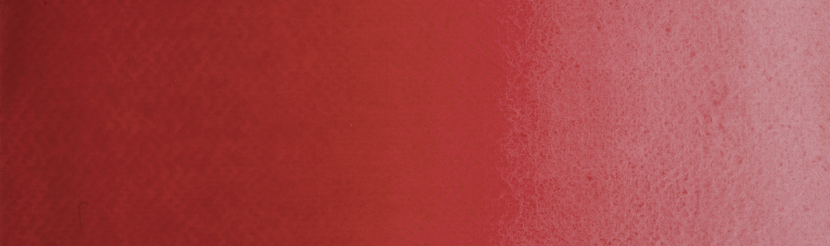
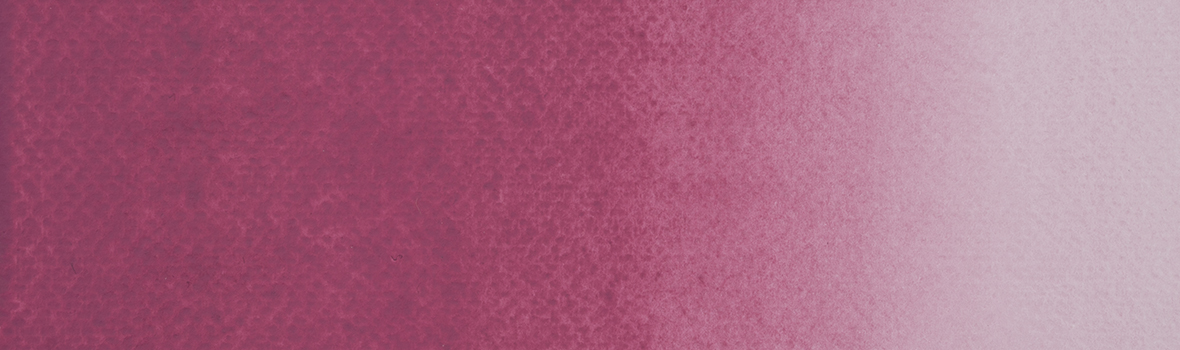
789 Red Rose Deep. Deep, pure, and incredibly vibrant red-pink. Its elegant coolness gives the colour a special sophistication, making it richer than classic reds. The single-pigment formulation ensures flawless purity and intensity even in the lightest glazes, creating a beautiful inner glow.
In botanical illustration, it perfectly captures the juicy flesh of berries and the petals of peonies, roses, or tulips. In portrait painting, this colour is indispensable for rendering a natural blush, while in landscapes it adds dramatic highlights of the evening sun. The pigment’s purity allows for vibrant mixes — from rich purples to fiery oranges. A choice for those seeking uncompromising intensity and professional expression in every brushstroke.
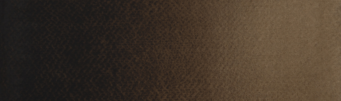
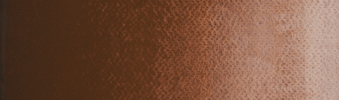
791 Vandyke Brown. Deep, warm brown that adds classic grandeur to your work and allows for dramatic shadows. Dense and restrained in mass, it reveals a soft golden undertone in washes, creating the illusion of light piercing through darkness.
It is indispensable in portrait painting for creating an inner glow, making the skin appear alive and infused with natural warmth. It is perfect for landscapes and animal painting, flawlessly capturing the texture of tree bark, the velvety softness of fur, and the monumental depth of architectural forms.
792 Buff Titanium. Warm beige colour that fills a painting with a sense of space and natural light. Its delicate creamy tone is the perfect alternative to pure white when it is important to preserve the softness of highlighted areas and avoid excess coolness in the palette. Thanks to its rich consistency and excellent opacity, this colour is indispensable for depicting the texture of sandy beaches, sea foam, ancient architecture, and sunlit highlights on clouds.
In portrait painting, it helps create natural, lifelike transitions of light and shadow on the skin. Titanium Buff reveals its full potential in mixtures, allowing artists to achieve complex pastel shades with a sophisticated vintage character.
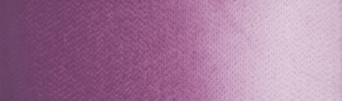
793 Rose Pale. Sophisticated, delicate, and complex pink colour with a distinctive ashy undertone that appears exceptionally modern, elegant, and natural.
Thanks to its unique pigment combination, Ashy Pink features a soft matte texture and excellent opacity. Depending on the amount of water on the brush, the colour lays down either as a perfectly even pastel tone or creates a subtle granulating effect that adds depth to the painting. It is indispensable for creating atmospheric backgrounds, delicate flower petals, pre-dawn skies, or soft shadows in portraits.
794 Lilac Pale. Complex smoky lilac colour with a distinctive cool undertone. It works delicately over other colours, allowing for both rich velvety layers and soft watercolour transitions. Depending on the pigment concentration and the amount of water on the brush, the colour lays down as a perfectly even pastel tone or develops an elegant granulating texture that adds exceptional depth to the painting.
This colour is indispensable in landscape painting for depicting aerial perspective, smoky horizons, and creating subtle gradients of dusk or pre-dawn skies.
In portraits, it is perfect for capturing complex cool shadows, while in floral painting it beautifully renders the delicate petals of irises, lavender, or lilac.
795 Nightfall Orange. A deep, complex colour that captures the drama of evening light and natural textures. Thanks to the combination of contrasting pigments, it reveals a rich orange-brown tone when applied in a dense layer, while when diluted with water it unveils a distinctive blue undertone. The supergranulation effect allows for exceptionally rich and unpredictable colour transitions.
Perfect for depicting urban architecture, it flawlessly conveys the look of aged brick, tiled roofs, rust, and metal patina. In landscapes, it is indispensable for capturing warm sunlight fading into deep twilight shadows. Twilight Orange is a ready-made professional solution for works where emphasizing paper texture and adding a sense of depth is important. By adjusting the amount of water, you can easily control the colour intensity and the level of granulation.
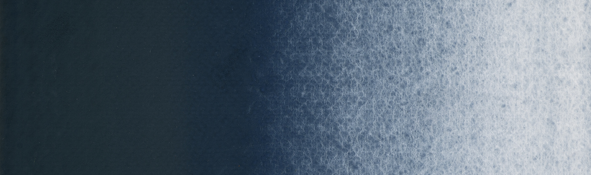
796 Nightfall Azure. A deep, magnetic blue with rich inner complexity. Thanks to its high ultramarine content, when applied in a dense layer, it appears as a deep evening blue, while when diluted with water it reveals subtle earthy and barely noticeable olive undertones. Pronounced granulation creates a lively, vibrant texture.
This colour is indispensable for conveying the depth of night skies, open seas, and for rendering cool shadows. It is perfect for depicting cliffs, wet stones, and atmospheric effects in twilight landscapes. Its semi-opaque pigment allows for complex, multi-layered washes even with a single colour. By adding water, you can easily adjust both colour intensity and the degree of granulation.
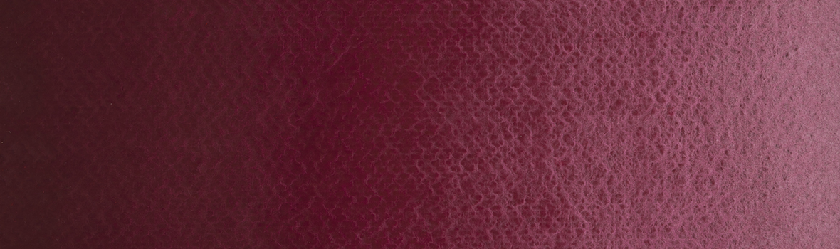
797 Rose Quartz Deep. A deep, complex, yet warm pink that captures the natural texture of semi-precious stone. Thanks to its unique combination of pigments, when applied in a dense layer, it appears as a rich terracotta-pink, while when diluted with water it reveals delicate powdery and barely perceptible olive undertones.
This colour is perfect for depicting architecture, such as historic facades and sunlit highlights on walls, as well as for botanical illustration — capturing the complex tones of roses or autumn leaves. In landscapes, it is indispensable for conveying the first rays of dawn and the soft gradients of the sky during the golden hour. Its granulating properties give the work a particularly velvety texture, while varying the amount of water allows for precise control over colour intensity and the depth of texture.
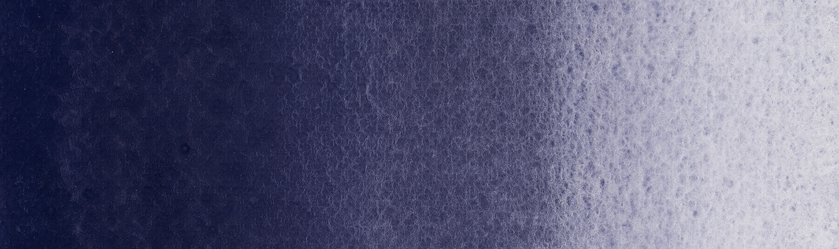
798 Ultramarine Grey. A noble and deep blue-steel colour with a pronounced cool character. Thanks to its balanced combination of pigments, it maintains purity and refined subtlety even in dense application. When diluted with water, the pigment reveals a complex, atmospheric blue with a pronounced ultramarine undertone on a soft, smoky base.
This colour is perfect for depicting stormy skies, ocean waves, misty mountains, and deep shadows. Its granulating properties create a sense of atmospheric movement and visual depth, making the colour indispensable for crafting evocative landscapes. By adjusting the amount of water, artists can easily control both the intensity of the colour and the degree of texture.
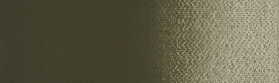
790 Olive Oxide Grey. An earthy colour with a deep, natural character. Thanks to its blend of pigments, it has a complex internal structure: in dense application, it appears as a warm olive-brown, while when diluted with water it reveals delicate silvery-grey undertones. Its granulating properties allow for a rich texture reminiscent of natural mineral surfaces.
This colour is ideal for animal painting and landscapes, flawlessly capturing the tones of dry grass, moss, tree bark, and patinated stone. In architectural sketches, it conveys the texture of aged concrete or ancient walls and produces realistic natural effects. By adjusting the amount of water, artists can easily control both colour intensity and the degree of granulation.
Key properties of ROSA Gallery professional watercolours:
• The colors of the paint are the same in both the tub, and in the dish - the only recipe
Paints are well blurry even after drying
• Base 100% natural gumarabic
• Most colours of the palette - single-pigment, which makes it possible to create pure shades when mixing
• High lightfastness of pigments will keep working in its original form over time
• 100 colors, basic and unique, clean and vivid, allow you to choose your favorite shades.
• 38 granulating colours in the palette, 19 of which are super granulating.
38 granulating colours in the palette expand the possibilities, bringing natural texture and depth to your artworks.
Immerse yourself in the world of professional watercolours, where each colour tells its own story. Experience the exquisite play of granulating pigments and the richness of the new palette.
Create art that captivates the eye and touches the heart with ROSA Gallery!


Follow us